Page 1 of 1
New H&D.net Design Concept [DRAFT]
Posted: Sun Feb 07, 2010 8:17 am
by Jason
Hey all,
Just started working on a new design concept last night. Please take a look and let me know what you think of it so far. I'm more of a programmer, so don't judge me too harshly
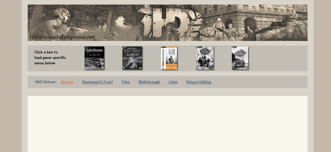
 Click here
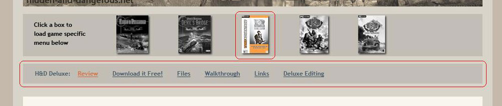
 for the design concept. The game boxes change the menu,
click here to see more of an idea of what changes what.
Should I change the colours? Ditch the new menu idea? Any suggestions?
Let me know what you think, constructive criticism welcome

Re: New H&D.net Design Concept [DRAFT]
Posted: Sun Feb 07, 2010 9:14 am
by -ViTaMiHnM203-
How do you judge constructiveness? The idea behind it is nice; I think the boxes should be in full color all the time and the instructions on the left should be cut down to 3 words or none at all. What I think needs changing is the "Home Help Search Profile Logout" on the forum pages. You are moving away from minimalist, slowly, but surely.
Re: New H&D.net Design Concept [DRAFT]
Posted: Mon Feb 08, 2010 11:25 am
by Alex K
Looks good. A new colour scheme might bring home the idea of new site/redesign more clearly but it's not a major issue. Perhaps a new screenshot graphic for the banner as well?
Re: New H&D.net Design Concept [DRAFT]
Posted: Mon Feb 08, 2010 4:56 pm
by Jason
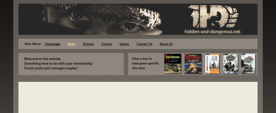
Thanks for the input guys, I have come up with another mock up based on feedback received check out
design mock-up version 2 here, please let me know what you think

Btw, the menu won't change with this revised edition, clicking a game box would just take you to that games main area
Re: New H&D.net Design Concept [DRAFT]
Posted: Tue Feb 09, 2010 1:48 pm
by -ViTaMiHnM203-
Oh, that's great. The colors are great, I love the boxes, love the banner. I don't know why, but I love the original HD and HDDB boxes. What I don't like, still, is the message telling you to click a box and the message you have on the left side.
I think the area on the left is good for a message of the day type thing, but that little message you have there is... eh.
Re: New H&D.net Design Concept [DRAFT]
Posted: Tue Feb 09, 2010 7:07 pm
by jonikka
AWESOME
love the eyes, and the combo of gray colors
Re: New H&D.net Design Concept [DRAFT]
Posted: Wed Feb 10, 2010 10:13 am
by Alex K
That looks great - just different enough to say it's a revamp but still with the same core identity. The only change I'd make would be to have an actual game screenshot as the banner. Perhaps a "revolving" one with shots from the different games and showing the various different environments? More work for you though....

Re: New H&D.net Design Concept [DRAFT]
Posted: Wed Feb 10, 2010 2:19 pm
by Jason
Thanks for the feedback guys, feel free to submit other ideas if you want. I will work on it over the weekend if not before and see what else comes to life. Stay tuned!